5 Tricks to Elevate Your Data Visualizations (+1 Bonus)

“Just as a picture is worth a thousand words, a data visualization is worth a million data points!”
– Hira Fatima, CAP (Lead Instructor @ www.LearnDataAnalytics.ca)
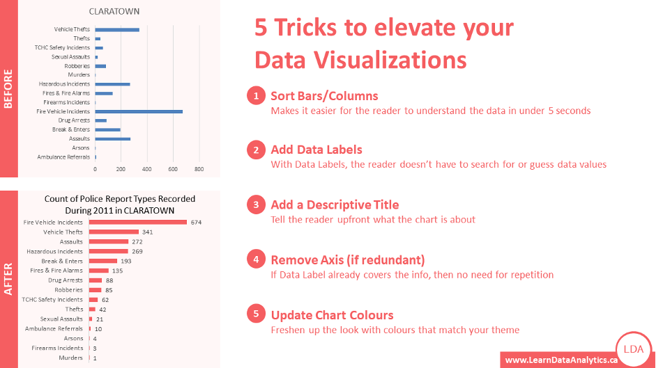
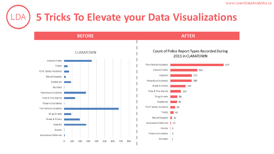
Understanding a million data points in one glance is nearly impossible, but if those data points are plotted in the form of a graph or chart, it would be much easier to see the patterns or outliers and consume that amount of data. We know making data visualizations is one of the most effective ways to analyze data and tell data stories, but not all data visualizations are effective. Let’s learn some quick tricks that can instantly take your data visualization from this (image on left) to this (image on right).

- Sort Bars / Columns – Sorting data makes it easier for the human brain to see trends. In our example, without sorting the data, you cannot the number of reports for Murders (on the left) or if there were more Murders, Arsons or Firearm Incidents. But after sorting, it is easier to see which values are higher or lower than others and by how much.
- Add Data Labels – Adding data labels takes the guesswork out of the picture. Data is fact-based so we shouldn’t be guessing anything anyway! With data labels, it is super easy to see the values of the bars as you scan through from top to bottom. It also makes it informative to see that there was only 1 Murder report as opposed to 3 Firearm Incidents. If the data labels were missing, it would be nearly impossible to tell this information by just looking at the graph.
- Add a Descriptive Title – Writing a descriptive title tells your reader upfront what the data and this data visualization are about – again, eliminating the guesswork. Without a fully descriptive title, the reader would be forced to make assumptions or come back with questions. For instance, here the first data visualization just says Claratown but doesn’t specify what the chart is showing about Claratown and for what time frame etc. The second data visualization clearly mentions that the data visualization is showing the “Count of Police Report Types Recorded During 2011 in Claratown”.
- Remove Axis (if redundant) – Now that we have added labels, the axis is just adding distraction and clutter to our image. If it is redundant and not serving any purpose, remove it!
- Update Chart Colours – Don’t just settle with the default system colours! Go one step further and update the colours to match your organization’s colour palette. This will instantly give your data visualization a happy makeover!
- BONUS TRICK: Remove Gridlines (if it looks too busy) – Similar to the redundant axis (in point #4), if the grid lines are not adding any value, remove them. Anything that is not adding value to the chart should be removed because it will distract the reader from focusing on what is important.
Want to learn more of these tips and tricks, especially with an experienced industry-leading instructor in a live session? Check out the beginner-friendly Data Analytics Courses at LDA (Learn Data Analytics) – Beginner-Friendly Data Analytics Courses, Hands-on Learning, Live & Online Classrooms, Led by Industry Experts!

1800-400-5321 | info@learndataanalytics.ca | www.learndataanalytics.ca
